Context
As the Lead UX designer, I worked for the first few weeks to build rapport and domain knowledge with the clients at Nielsen. Once the work was defined, we brought in two junior designers, who helped build intermediary screens and contribute to the final deliverable, a prototype whose purpose was to build executive support for funding for this new tool in Nielsen’s media planning ecosystem.
My immediate concern was a lack of user interviews with analysts, but we were able to gain access to prior research and design from tri-weekly Client touchpoints. The final deliverable’s secondary purpose was testing with users sourced from the sales teams, if time and budget allowed.
Challenge
Define a new tool for Nielsen’s digital toolkit through iterative prototyping. Specifications, conveyed through numerous client touchpoints, were to develop a workable prototype for the assumptive user: the Junior Media Analyst. The assumptive user would have much less experience with Nielsen’s legacy media planning tools — MPO and Biz Point — and need an updated tool that was (relatively) simpler to use.
Role
- Client Lead
- UX Research
- UI Design
- Prototype Development
Timeframe
4.5 months
Tools

Defining the User
Sarah Schultz
Profession: Junior Media Analyst
Education: Bachelor’s degree in Communications
Experience: Internship at a digital marketing agency, coursework in media analysis and market research
Interests: Data analysis, social media trends, digital marketing strategies
Pain Points
- Limited Experience Sarah lacks extensive professional experience in media analysis, which can make her feel uncertain about her skills and abilities.
- Overwhelmed by Data Sarah may feel overwhelmed by the vast amount of data she needs to analyze and interpret.
- Unfamiliarity with Tools Sarah may face limitations in utilizing analysis tools, as she isn’t familiar with what represents opportunity in markets.
Motivators
- Learning and Growth Sarah is motivated by opportunities to learn new skills and grow in her career.
- Recognition and Validation Sarah craves feedback and recognition to boost confidence.
- Being Part of a Team Sarah values collaboration and enjoys working and learning from colleagues.
Goals
- Contribute to Successful Campaigns Sarah’s wants to quickly demonstrate her value to her manager and team.
- Develop Analytical Skills Sarah seeks to enhance her data analysis skills, and wants tools that help her achieve this goal.
- Gain Practical Experience Sarah aims to gain hands-on experience in media analysis to build her confidence and proficiency in the field.
The Nielsen Landscape
Budget Planner was designed to occupy the space where less technical analysts and marketing staff could quickly sketch out budget planning for a variety of Brands, Markets, and Channels.
I mapped out its functionality through assumptive screen flows to understand the preceding applications in the Nielsen ecosystem. Due to timing issues, and Nielsen client privacy stipulations, we were not given a demo of the legacy products until the 4th week of the engagement.
Synthesizing and
Concepting Nielsen’s Future
After a week or two the exercise was clear. The existing Nielsen product line needed a refresh, as the offerings were split between a deeply featured, complex tool that came with the overhead of training, embedded consultants, and a high price tag (MPO) and a highly specialized tool that was not as user friendly (BizPoint).
The concept that I was tasked with sketching out and concepting required evaluation of the current tools, understanding of the user base (as conveyed through SME and Client inputs), concepting and validation of features, and
getting buy-in on the product direction from senior stakeholders.
The process was going to shortcut orthodox UCD methodology; We would have to create it collaboratively to enable the funding that would result in a tangible product.
BizPoint Evaluation
This application is currently live, a precursor to Budget Planner. It became understood that Budget Planner would replace this tool, offering a simplified interface and enhanced workflows.
Templates to start Projects: Templating projects was low-hanging fruit for the application. Media buyers frequently had to recreate their projects from scratch, and the ability to base the project off a past Brand buy or project with similar attributes was a common design pattern we felt we could deploy to make the project creation faster.
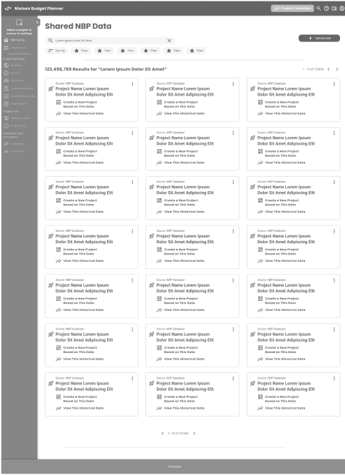
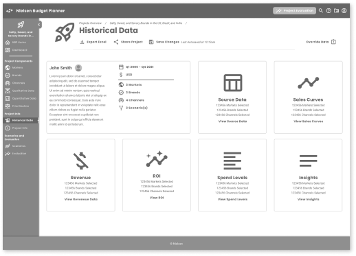
Learning Moment: Historical Data was NOT data that would help populate Projects or Scenarios. Rather, it was an aggregate of all other spends and metrics from Nielsens’ extensive database, and could give average numbers and ranges of spends, markets and likely channels. The junior analyst was encouraged to refer to, but not base decisions on Historical Data values.
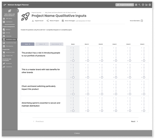
Qualitative Inputs: The workflow to input “Qualitative” inputs was a series of sliders that would define the attributes of the Brand. One area of opportunity here: the input might be relative to the Media buyer’s experience and there could be different rankings (opinions) based on a specific media buyer’s disposition.
Some assumptions:
- Qualitative input is subjective
- Qualitative data is not aggregated in a consolidated database
- Qualitative data may be relative to other brands and their attributes could shift concerning other brands
Comparative Budget/ROI: The Neilsen tool predicts the ROI for any budgetary spend, but is not capable of comparing multiple spend scenarios. “Finding the best bang for the buck” is part of the fine-tuning that junior Media buyers needed to present to managers. Outstanding were the technical constraints that might make the calculations necessary for comparative evaluation possible.
Qualitative Data
Nielsen had amassed a huge trove of subjective user data for evaluating markets, geographies and campaigns. How could we give users access to this Qualitative Data across the application? Would one campaign’s data be relevant to another?
In order to give users the same advantages of Qualitative Data that users had to Historical Data, creating a consolidated library of Qualitative data and averaging out the brand attributes across multiple projects was proposed. The Client saw it as a value add and would look into the feasibility with the tech team.
MPO Evaluation
A tool is for power users who need to tweak and reach a deeper granularity than basic users. It also expanded the scope of any campaign to include buying, the action of media, and evaluating the campaign’s effectiveness. Frequently Nielsen would be contracted to consult and train on the tool, a valuable revenue stream that helped support its status as a flagship offering.
Project Creation and Optimization is one part of the MPO workflow; where BizPoint (and Budget Planner) are primariliy for Project and Scenario creation only. Optimization also occurred during Scenario creation and after the final Records/Final Plan was submitted. Optimization was also more of a manual operation and required a good deal of industry knowledge to perform each stage correctly.
Budget planning and financials are core to the tool; features not included in Biz Point & Budget Planner Projects are scoped to Campaigns; multi-brand, and multi-market spending, over longer periods
Campaign Creation is more so than just a simple market/product/geography mix, campaigns were fully built out plans that spanned longer time frames. These are daunting to even seasoned analysts and carry higher risk depending on the timeframe. Campaigns generated would also require approvals and more detailed budgetary explanation.
“Export to Excel” is essential for additional data wizardry.Users are experts at spreadsheet manipulation, and prefer to run reporting in sheets that contain all scenarios, spends and campaigns.
Defining
Budget Planner
After the evaluation of the other tools and conferring with the Client and other stakeholders, we hashed out the defining attributes of the product for the remaining time we had:
Simpler, easier use for a broader audience.
This was Neilsen’s first exploration into leveraging UX to expand its entry-level media planner segment.
Faster evaluations without deep market knowledge.
Junior analysts and their managers didn’t need prescriptive directions, but they needed the ability to see ranges of outcomes. Decisions were made through many approvals, and getting evaluations quickly sped up the process.
Present Reporting to higher-ups.
Junior users are not always Excel wizards — the tool requires native presentational features to evaluate scenarios. Data visualizations helped junior analysts communicate more effectively.
Show us how it works.
A product prototype + specifications that validates further development. This exploration hopefully leads to increased spend in the coming fiscal year, and a new, modern product.
Designing Budget Planner First Steps
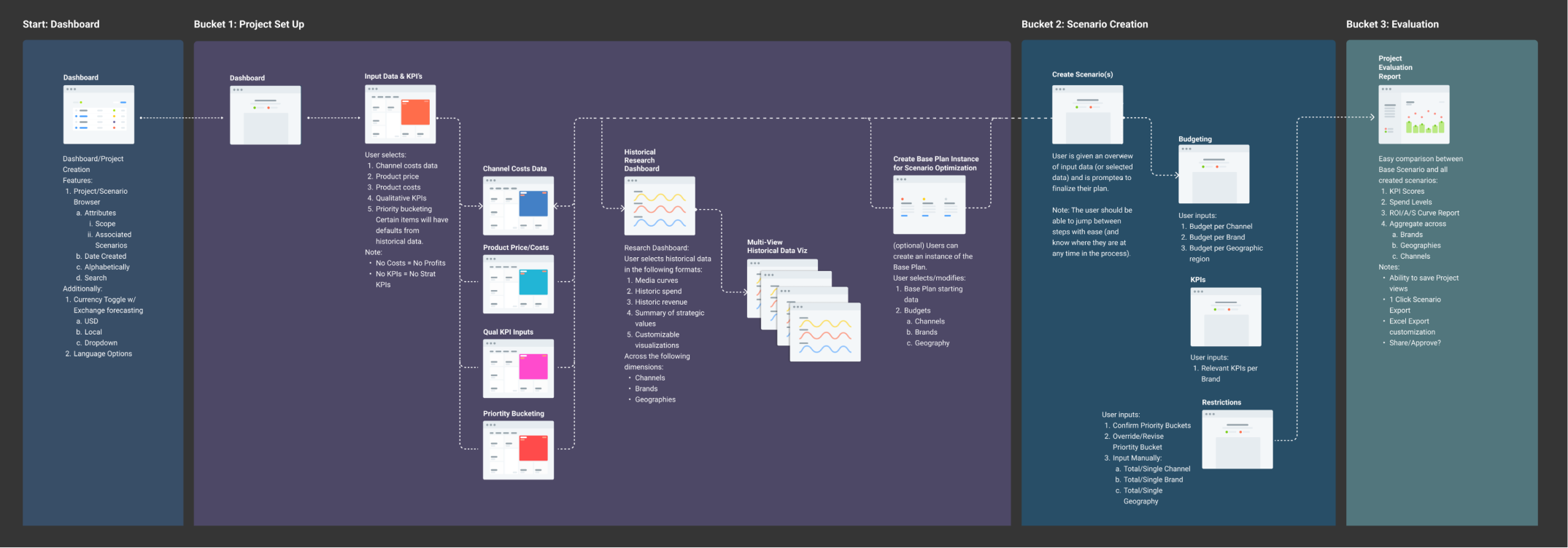
Defining how the application should work was done through multiple iterations of screen flow diagrams. Validation of the screens were done in weekly meetings with the Clients, SMEs and other stakeholders.
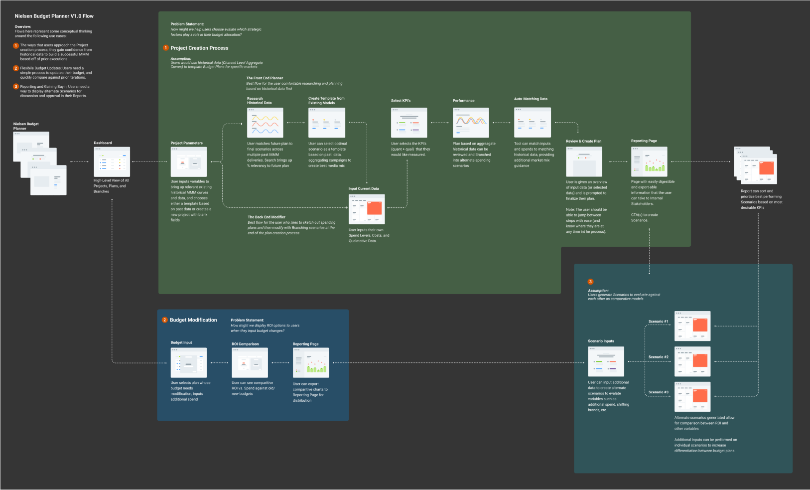
A centralized Dashboard of all user Projects (and others, as shared by colleagues in their group) was desirable.
Project creation happens after Historical Data review (not always the case).
Inputs can be validated against Historical Data and other Projects/Scenarios (while there is no data architecture to support that featureset, there should be).
The tool should be able to sort on ROI and other reporting metrics to surface the best scenarios (helping junior staff more quickly evaluate what to present to managers).
Iterative Development
Defining how the application should work was done through multiple iterations of screen flow diagrams.
Project Dashboard can be viewed in list/card format, with sortable and filterable attributes, visibility to personal/group projects, and task/completion metrics and markers
A revised “Plan Builder” flow with a progress completion indicator, no mandatory inputs (although warnings are displayed if inputs are not sufficient for expected outputs)
Scenario Inputs are made easier through:
- Excel imports (a universal ask)
- Drag and drop capability for brands/markets/regions
- Qualitative slider controls
Scenario Building: Inputting constraints, a tough manual task that requires deep market knowledge, are now in preset ranges. Outputs are generated on the fly to see results (need technical validation)
Enhanced Reporting capabilities:
- Excel export features (for inclusion in managers reporting)
- Graphing and visual outputs—although representing 3 variables was going to be a challenge (brands, channels, and geographies)
Concepting
Starting the concepting process, we sketched key screens to help explain the Project Creation, Constraints, Scenario Creation, and Evaluation moments in the application flow. Throughout this effort, these evolving screens helped us align with the client and demonstrate design patterns that would help the user achieve their goals.
Project/Scenario Browser
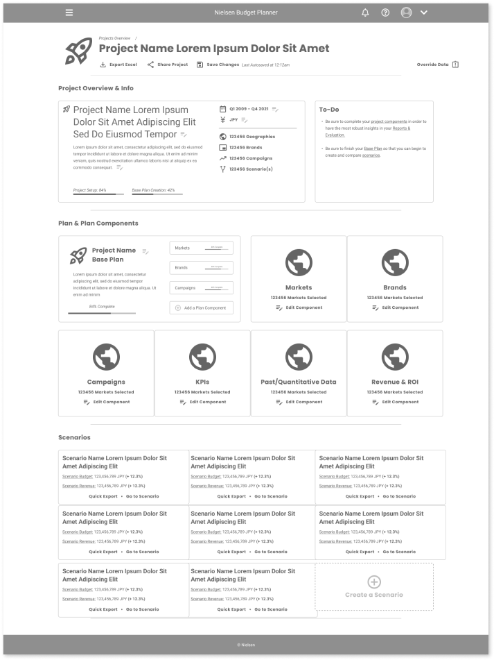
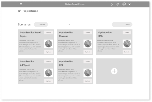
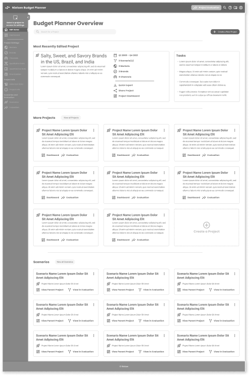
The Main Project window acts as a home page to review current projects, create a new project, and see groupings of other active projects and recent scenarios. Unfinished projects are highlighted. Tasks are listed in order of importance to complete unfinished projects.
In this view, users can:
- Sort/Filter/Search Projects and Scenarios
- Persistent Views based on an authenticated user session
- Create and save different Views
- Quick Preview/Export
Plan Builder
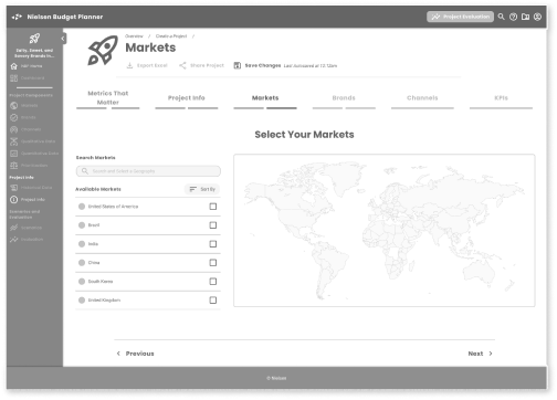
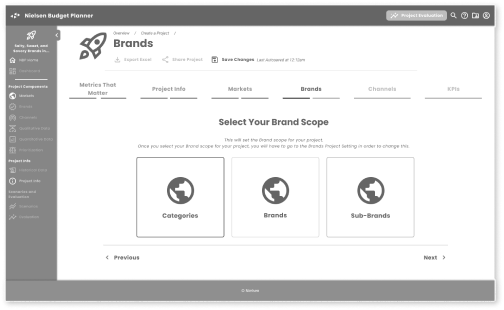
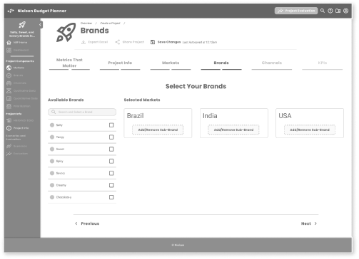
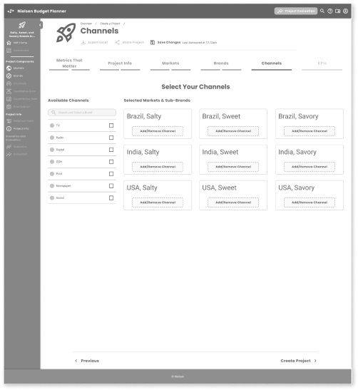
The initiation of each Project brings up a progressive Plan Builder that allows users to input data without feeling overwhelmed, also letting them know where they are in the process. Users can stop, save, and go back as needed.
Defining Where
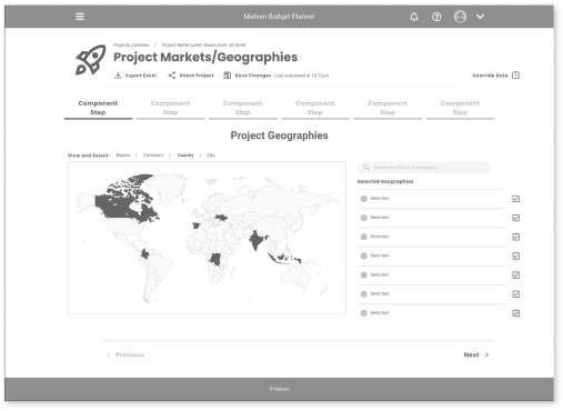
Pick using graphical inputs for Geographic regions as well as choosing labels. Chart/map is interactive to choices and users can see which global regions they’ve selected.
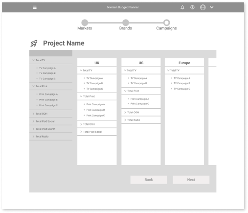
Build Markets Quick
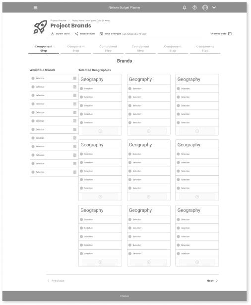
Brands available to each region are selectable and draggable into each Market bucket. Top-level categories are draggable, bringing in all their child categories, users can delete unwanted categories. Users can choose to duplicate their assortment from Market to Market.
Don’t Duplicate Work
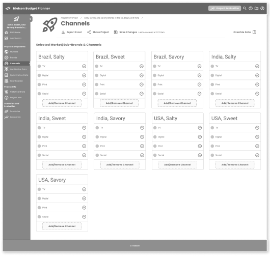
As with Market selections, users can select Campaigns as a grouping and duplicate across Markets.
Visual Inputs
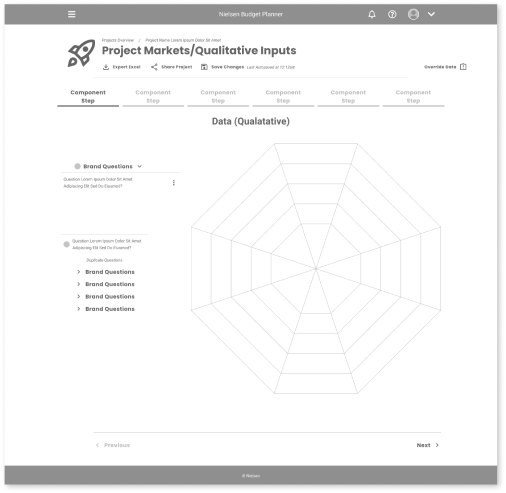
Qualitative inputs are easier to enter and modify with progressively displayed questions, and a radial line graph so users can drag vertices to set their inputs. Multiple markets and inputs can be duplicated, overlayed, and evaluated in a more efficient process.
Visualize
Historic Data
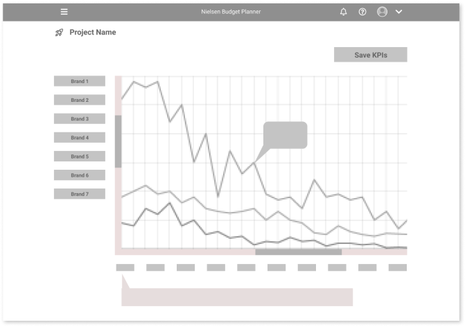
Users have a greater choice for reviewing data through different graphs with more interactive inputs.
Setting Constraints
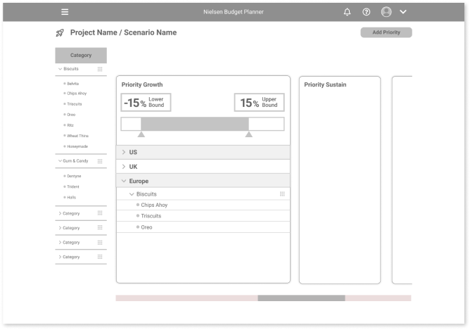
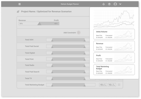
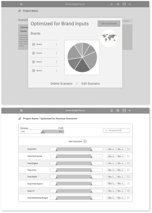
Inputting and managing budget constraints is made easier through a card-based interface. Each card is maximizable to input constraint data. Cards are sortable and filterable.
Scenario Modeling
After creating a Base Plan, Advisors will want to identify, organize, modify and evaluate their Scenarios. These concepts were designed to help in that regard.
Reporting
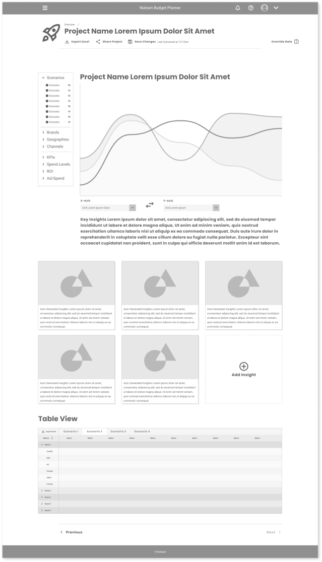
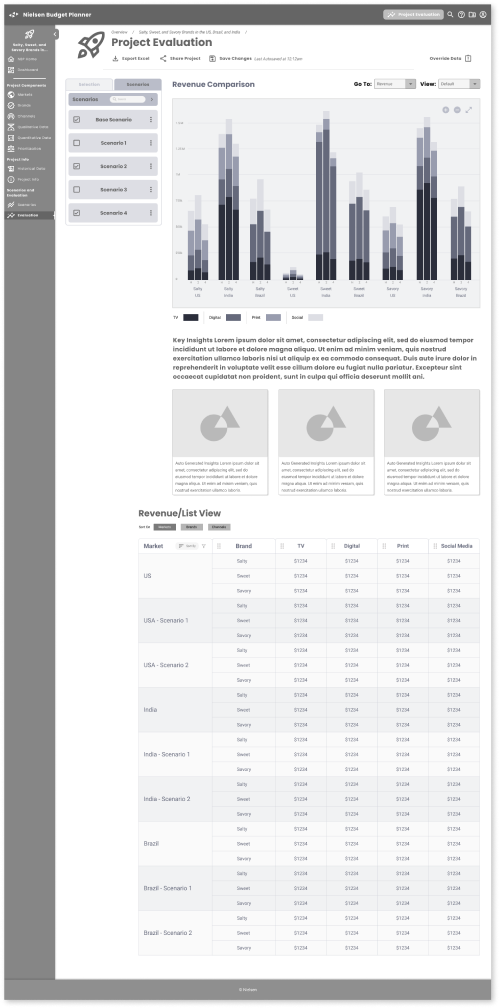
The final report is characterized by the ability to review data in multiple ways. Brands and markets can be toggled on/off to change the graph readout. Individual Scenarios are represented by different cards with numeric and graphical representations of their outputs. A table view is also provided to preview the data fields for users who want to output to Excel formats.
Final Deliverables
The final product was showcased to the larger Nielsen team, including management heads in Business, Product and Tech. I ran through screens and final prototype examples, and we gathered feedback for debrief with the core team.
Final Screens
These screens were co-created in weekly client meetings, where we refined the original concept screens to include navigation, features, content, page hierarchy, and design patterns the client felt would test well. They covered the following buckets:
- Overview/Dashboard Project Creation:
- Initial Inputs Project Creation:
- Qualitative and Quantitative Data
- Project Validation:
Historic Data Review - Project Modification:
Scenario Creation - Reporting:
Evaluation Screens
The Dashboard is a new concept; neither BizPoint or MPO had a central place where users could view, organize, and share plans that they and other team members had created.
The nav bar is contextual to the page hierarchy, collapsible, and can be minimized for power users. We introduced a Projects and Scenario card pattern, with actionable pathways, icons, and essential information on the most recent Project, as well as a Task section.
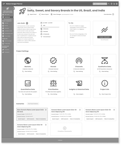
At the Project level page, we proposed large, easily navigable elements that analysts could use in a nonlinear fashion. Analysts did not always have enough insights and information to fully complete the project, but they now had a place to park information and could set reminders when more was needed.
Input Screens
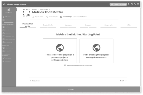
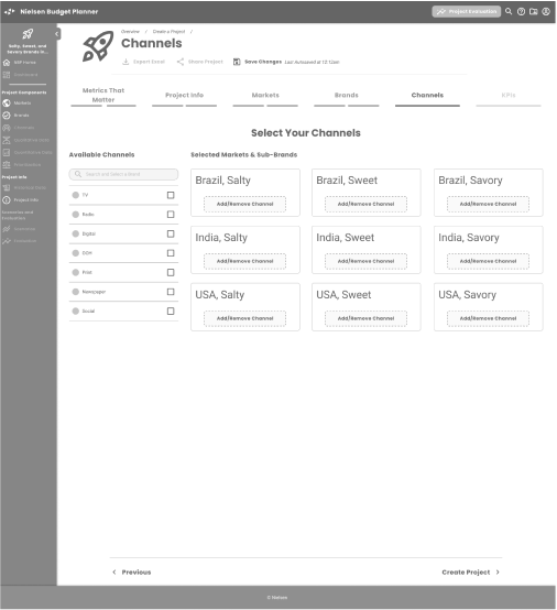
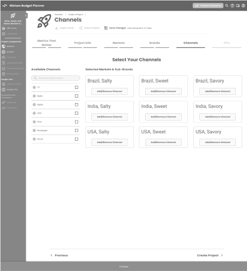
We set up Project creation as a sort of wizard, with progress indicators, simplified graphical inputs, and the ability to choose where to start — from scratch or a previous project (MPO and BizPoint had no way to reuse records).
One of the areas that emerged as a challenge was the Markets/Brands/Channels model. The inputs were straightforward, and patterns such as drag and drop, sliders, and graphical maps were universally client/proxy user-approved, but the complexity of three sets of variables resulting in many possible combinations was something that needed teasing out. The three dimensions of data didn’t lend themselves to quick spreadsheet interpretations.
Additionally, the KPI inputs ran counter to best UX practices, as they’re essentially comparative, subjective statements that are best evaluated in conjunction with one another. We created a flow that would progressively lead users through the qualitative inputs, but the Client (and potential users) knew that the users needed the large data set displayed in its entirety. We simplified the inputs across Brands with a “master” input, inspired by audio engineering mastering controls.
Qualitative and Quantitative Data
After the initial inputs that make up the skeleton of the Project are completed, there were Qualitative and Quantitive data that needed to be input
Qualitative: Subjective inputs into the Brand’s perceived impact, value, performance, timing, and other variables. This was most difficult for the design team to initially understand, as they were based on an analyst’s experience, and we assumed there was a good deal of bias from their experience with brands/markets/geographies.
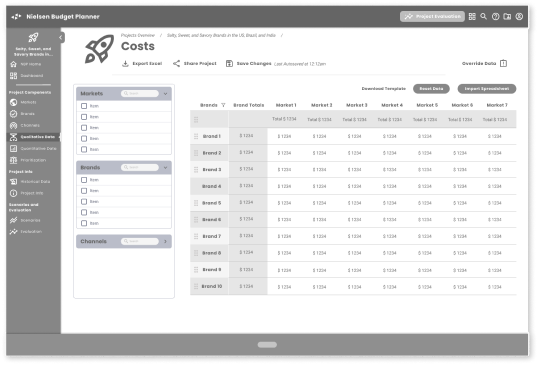
Quantitative: These inputs are the variables that set the base attributes for the Base Scenario (what we coined as the template for the main Project/Campaign). These included which channels might be most effective in a certain market, the types of brands that resonate within a market/geography, or what are the upper/lower spend limits on any given marketing mix.
Historic
Data Review
As stated previously, analysts, especially our core audience with basic to intermediary experience with the brands/markets/geographies, need to validate plans, and Nielsen’s large and growing dataset known as Historic Data has been used as a proofing mechanism. Both MPO and BizPoint used Historic Data in comparative models, but interfaces were less user-friendly and needed expert interpretations to evaluate properly.
The screens here were a precursor for Evaluation screens, leading to the Reporting screens that map the Base Plan against Historic Data, giving the user predictive analyses, including ROI, recommended Channel spends, Revenue, and Brand Awareness. Use cases here are for analysts to review their assumptions, which we formatted into various display and graphing patterns based on data input and expected.
Scenario Creation
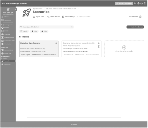
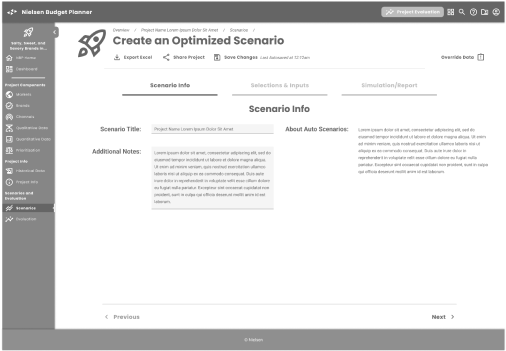
The tool’s ability to generate options, referred to as Scenarios in the Nielsen ecosystem, is the core functionality of Budget Planner (as well as predecessor applications BizPoint and MPO). A good portion of the user’s effort is expended here, as the tool and analyst work to identify overlooked opportunities from prior campaigns. The flow is the creation of Scenarios for Reporting, which highlights the deltas users are looking for.
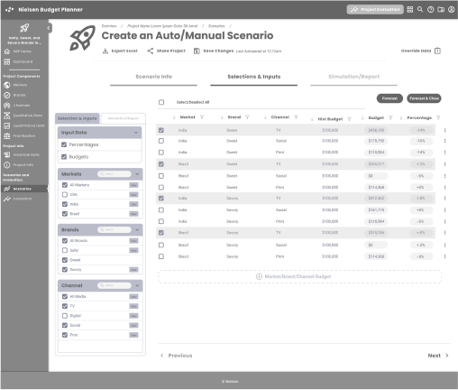
We treated Scenario creation in the same fashion as Project creation, with a progressive flow that allows users to use Historic data (or not; not recommended) to create an Auto or Manual model. Historic Data in the auto function helps the user surface the delta between models, and in the final interface, we recommended alerts, toasts, and notification states to give users visibility to what data recommends, and what they might choose to do off-plan.
We supported the unified feel of the app with progression indicators, drag-and-drop presets for optimization spends, and a tabbed simulation readout that would have calculated proposed changes, and displayed basic previews of reporting data. The latter was subject to technical review, but we felt that with current-day architectural upgrades, this would be possible and a highly useful function for speed optimization.
Reporting: Evaluation Screens
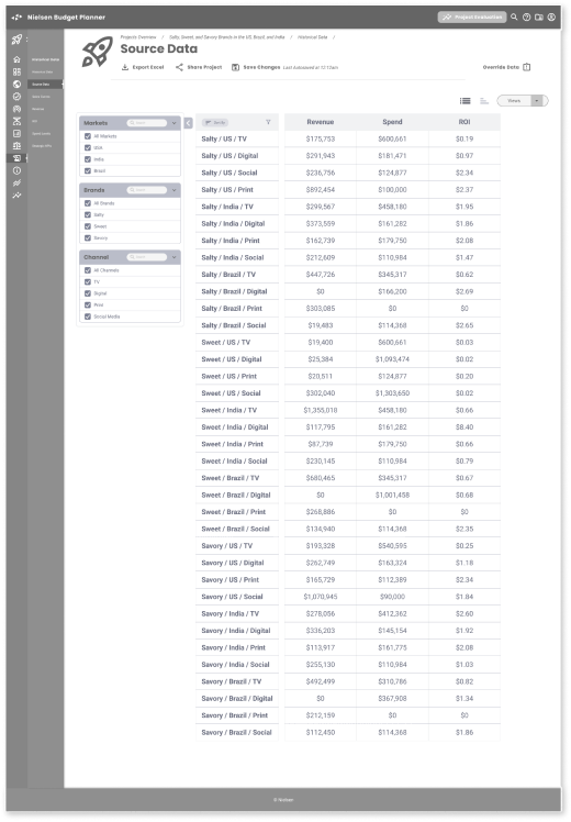
The final result in all tools was Reporting, and in MPO and BizPoint this was frequently the export of an Excel spreadsheet that senior analysts and managers would manipulate for presentations and approvals. Excel export would always be an option, as many analysts were Excel super-users, but we wanted to leverage dataviz/charting functions to help both junior and senior users understand opportunities ahead of further data manipulation.
We did talk with technical leads at this point and explored the D3 and/or Highcharts libraries as suitable environments. These stakeholders became more available as the visibility of the work was communicated through departments and management. They and others were excited about the possibilities that these screens represented.
Some Reporting highlights:
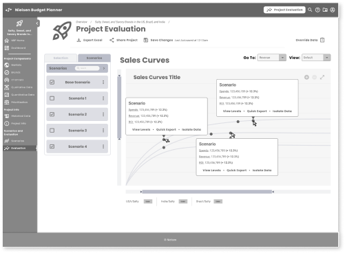
Selectable Scenarios: The ability to toggle between multiple Scenarios and see the resultant data gave analysts greater storytelling capabilities. Jump to edit functionality from this screen allowed analysts to quickly make changes in review meetings as well.
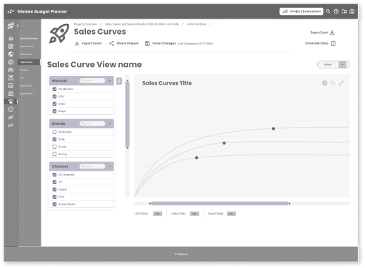
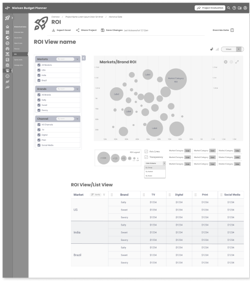
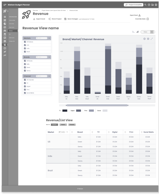
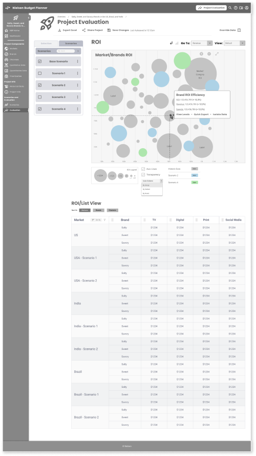
DataViz: We chose the right data visualizations for the data displayed; stacked bar charts for Channel/Brand Revenue and Spends, logarithmic curves for Sales Curves (with on-the-fly calculated data points), and bubble charts to help visualize ROI/Brand Efficiency using all three variables. The ability to toggle Scenarios gave analysts greater ability to cumulatively build their stories, present to managers and executives, and possibly supplant pivot tables and graphs in Excel.
Flexible Grids: The native way that analysts prefer to view info was in grids, and we added the ability to prioritize views on any of the three Market/Brand/Channel combinations.
Result & Handoff
The last few meetings with the Client, their management team, and a more diverse group of stakeholders were well received, and the product walkthrough garnered several accolades and questions.
Positive Feedback
Its ability to fill the gap between aging platforms (MPO and BizPoint) was seen as a successor to BizPoint rather than MPO. The installed user base of MPO experts and the accompanying training services were extremely profitable for Neilsen, although some of the UX efficiencies we introduced could be implemented in their MPO flagship tool.
Although there were assumptions around analyst behavior and a lack of usability metrics to fall back on, the tool was seen across stakeholders as an upgrade and addressed observed user needs and prior feedback. We were given the ability to reach out to the sales team to gather candidates for testing if the project budget allowed.
The interface assumptions, whether they were drag and drop patterns, dataviz screens, or backend calculations, were seen as feasible by the tech leads. At the time, Neilsen did have a robust design library or component system, so conversations were about emergent capabilities rather than constraints.
Questions around undefined assumptions
Our understanding of Historical Data, and how it would be asked to be predictive. This was an area that had been previously raised at Nielsen, and the ways we saw this dataset reacting to user inputs were unproven, or the architecture wouldn’t support it in its current state. There were no data stakeholders in attendance, and it’s possible that our project work would be used to influence future possibilities.
Testing: Since we had not been given a license to develop with boots-on-the-ground users, the risk of the project was understood, and the possibility of testing was offered. In subsequent conversations, we came to understand the tensions between sales teams providing users for testing, and those same users expecting that functionality in the next release. Since these same users were tied to revenue targets, Sales was unlikely to comply and we would have needed additional funding for third-party user candidates.
How to leverage? As much a question for our Client Project lead, the work was seen as influential in next year’s budget process, future research into the market for the new tool, competitive analysis (there were fewer competitors in the specific niche), and the business value of Historical Data and the new data that might be generated by this tool.
Takeaways
Can you build a tool with few to no live user inputs? This feels like a perennial design question. However, from the work that was achieved here, I believe it may be possible — but we have to work to define success upfront. The scope of the project was unclear in the first two weeks, but since the Client had a clear understanding of the output, I was able to align and succeed.
Some of the things that contributed to the project’s success:
Areas of opportunity:
The Deep Domain: The audience and users of the proposed tool, even though they were junior and the exercise was intended for market expansion, were specific, and user needs and goals were well-known to the Client and supporting team.
The Scope: From the outset, I approached the project as I would any discovery process, and assumed I needed more input. The Client stated otherwise, and we aligned on the output — a non-production-ready tool. Its purpose was to influence and prompt more questions, to highlight the need for a more connective application in Nielsen’s product lineup.
The Team: The Client was based in Sweden, with stakeholders calling in 2-3 times a week from across the EU and North America. They had worked with other Neilsen tools as analysts, and we brought senior managers and others who worked closely with the intended audience into the conversation. I was also given two designers who switched onto the project when appropriate.
Users: Getting a closer view of actual problems would have helped us build an application that was more in line with goals and pain points, and would have gotten us closer to a validated, production-enabled MVP. The cost differential may have been negligible, and a discovery process with users may not have exposed them to the “thing” that would have been perceived as a threat to revenue.
Client Alignment: We did not have a project brief, and there were no discovery exercises to shortcut the understanding of the project scope and deliverables. A quick Miro exercise and some deft facilitation could have saved time upfront.
Followup: We ran out of time/money as we wrapped up. Some questions around how Nielsen could develop their Historical Data, and all other datasets may have resulted in more realistic technical constraints, or a roadmap for systems architecture to accelerate functionality across all tools.
Current Day
Since the time this project was initiated, there have been significant advancements in how we work with data and what I’ve learned about possible outcomes. Some of the questions I had about the predictive nature of the application based on legacy Projects and Scenarios seem to be even more relevant today. Large Language Models and the AI algorithms that can utilize them seem like a natural fit for Nielsen’s business model. Even the ambiguous nature of the Qualitative data that are generated in Business Planner is ripe for natural language processing.
I’m sure there are current-day plans at Nielsen to leverage their greatest asset: the vast amount of data they have on media, consumer behavior, and the markets that influence them. It is reasonable to conclude that this exploratory work could play a role in advancing the direction Nielsen is headed in leveraging its key assets and competencies.


